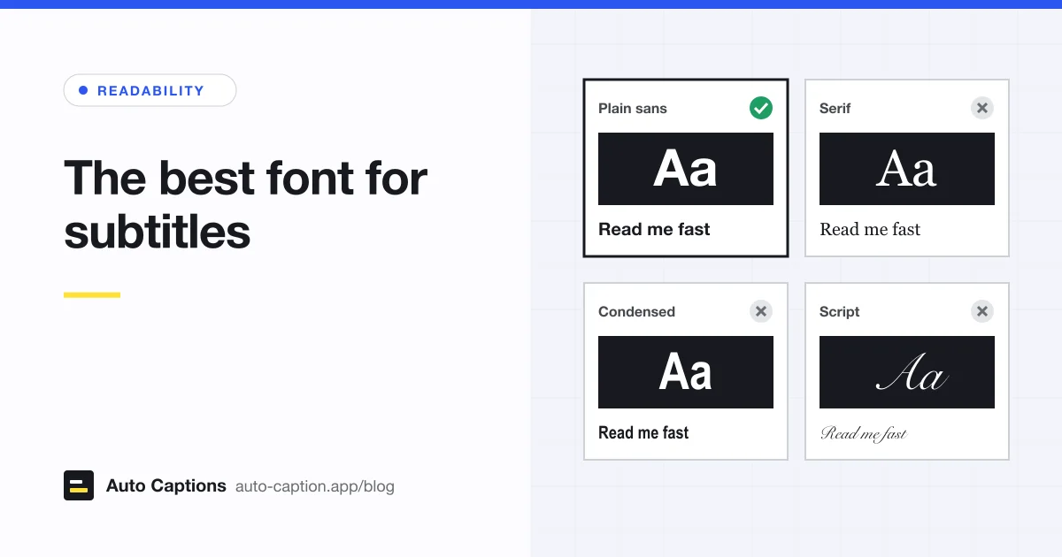
A subtitle font has a harder job than almost any other text. Each line is on screen for a second or two, over a moving picture that might be a white wall one moment and a dark room the next, and the video has usually been compressed before anyone sees it. So the winning font is rarely the prettiest. It's the one people read at a glance without noticing it.
One thing to settle first: the font only matters when you burn the captions into the picture. With closed captions, the player decides. YouTube, for example, lets viewers change caption font, color, size, background and edge style themselves. When you export an MP4 with open captions, every choice below is yours and viewers can't undo it.
What makes a subtitle font readable
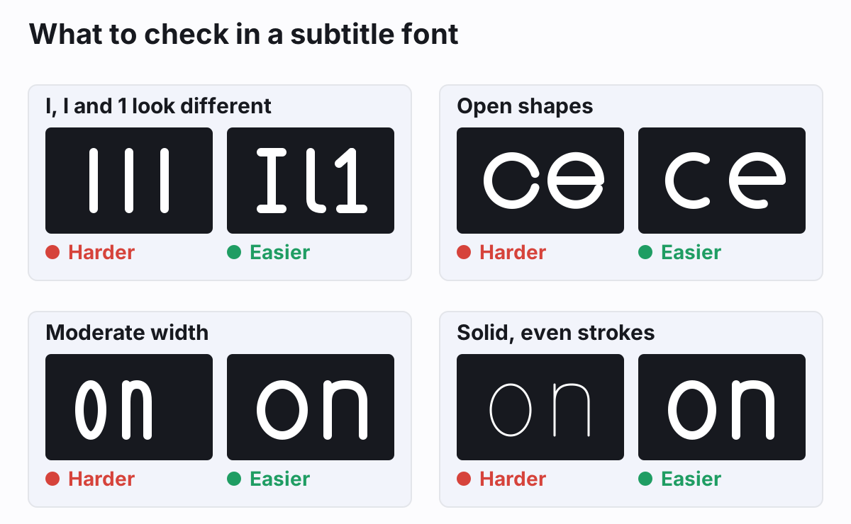
I, l and 1 look different
In many popular sans serifs the capital I and lowercase l are the same plain bar. In a book you'd never notice. In a subtitle that flashes a name, a code or a number for a second and a half, you might. Microsoft's own description of Verdana points out that i, j, l, I, J, L and the numeral 1 were drawn to be as distinct as possible for screens.
Open shapes
Look at the gap in c, e and a (typographers call it the aperture). When it's wide, the letters stay distinct at small sizes and after compression. When it's tight, they start to look like o.
Moderate width
Condensed fonts fit more words on a line, which is tempting, but narrow letters crowd together and "rn" starts to look like "m". Very wide fonts have the opposite problem: fewer words per line. The BBC tells its subtitlers to author in a wide font such as Reith Sans, Verdana or Tiresias, because a narrower font on the viewer's device will then still fit.
Solid, even strokes
Fonts with thin hairlines (most serifs, many display fonts) lose those hairlines at small sizes, and a video encoder smudges what's left. Pick a regular-to-bold weight with strokes of even thickness.
That rules out script, handwriting and decorative fonts, and most serifs. It doesn't rule out personality. A bold, rounded or geometric sans can carry a brand and still pass all four checks.
Eight subtitle fonts worth using
Each one is either built into Windows, macOS or iOS, or free to download. I checked where each one is available on October 1, 2026.
| Font | Where to get it | Why it works | Watch out for |
|---|---|---|---|
| Verdana | Ships with Windows and macOS | Designed for screens, wide spacing, distinct I, l and 1 | Wide, so fewer words per line |
| Atkinson Hyperlegible | Free from the Braille Institute; also on Google Fonts | Built for low-vision readers, with clearly different 1, I, i and l | Looks a little quirky to some eyes |
| Roboto | Google Fonts (SIL Open Font License) | Android's system font, familiar and neutral, many weights | Capital I and lowercase l are close |
| Open Sans | Google Fonts (SIL Open Font License) | Open, friendly shapes and a comfortable width | Very common, so it won't stand out |
| Noto Sans | Google Fonts (SIL Open Font License) | Part of Google's Noto project, with matching fonts for a huge range of scripts | Other scripts are separate Noto families |
| Inter | Google Fonts (SIL Open Font License) | Designed for screens, tall lowercase letters, heavy weights available | Plain I and l bars |
| Arial | Ships with Windows and macOS | Netflix names it as its generic sans serif placeholder | Identical I and l, tight letter openings |
| Helvetica | Ships with Apple devices | The BBC suggests system fonts such as Helvetica on iOS | Tight apertures, identical I and l |
My order of preference for burned-in captions is roughly the order above. Verdana and Atkinson Hyperlegible pass every check in the diagram. Atkinson Hyperlegible comes from the Braille Institute, which describes it as designed for low-vision readers, and a newer Atkinson Hyperlegible Next with seven weights came out in 2025. Roboto, Open Sans, Noto Sans and Inter are solid, neutral choices on Google Fonts under the SIL Open Font License, so you can use them in commercial videos. Noto is the one to reach for if your captions aren't in the Latin alphabet. Arial and Helvetica are on the list because they're everywhere and they're what many players default to, not because they're ideal.
For the BBC's broadcast subtitles, the encoder draws each subtitle as an image using Tiresias Screenfont, so you'll see that name in broadcast specs. You won't need it for social or web video.
Subtitle font size
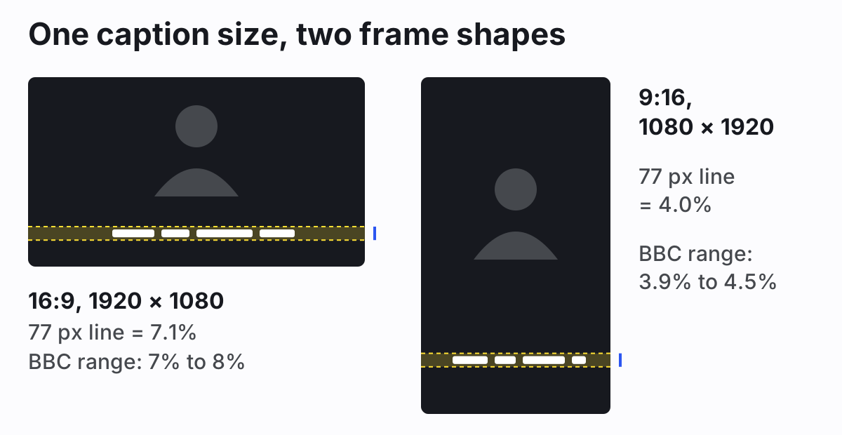
Forget point sizes. The same "24 pt" means different things in different editors and at different resolutions. Size captions as a share of the frame. The BBC Subtitle Guidelines are the most exact public source here: the line height should be 7% to 8% of the video height for 16:9, 4:3 and square video, and 3.9% to 4.5% for vertical 9:16 video. The vertical range is the landscape one multiplied by 9/16, so that the text comes out about the same size on the viewer's screen either way.
On a 1080p landscape video, 7.5% is a line about 80 pixels tall, which works out to a font size of roughly 65 pixels. On a 1080 × 1920 vertical video, 4.2% is also about 80 pixels. Short-form captions are often bigger than this on purpose, with two or three words at a time in heavy type. That's fine as long as the line stays short and clear of the face and the app buttons.
In our editor, text size is set as a percentage of the video's shorter side. The Karaoke, Classic and Boxed presets use 5.8%, and with the default line spacing that gives a line 7.1% of the height on 1080p landscape and 4.0% on vertical, inside both BBC ranges. Bold pop uses 7.5% and uppercase, for short social lines. The Text size slider goes from 3% to 12%.
Outline, shadow and box settings
No font survives a bright, busy background on its own. White text needs something dark around it, and there are three ways to do it.
- An outline (stroke) traces each letter in a dark color. It keeps the picture visible and works for most footage. Keep it moderate: a very thick outline fills in the openings in letters like e and a.
- A drop shadow is softer and looks less like a caption, but on its own it's weak over white or pale scenes. It works best together with an outline.
- A box (background band) is the most reliable. The BBC's subtitles are white, or a speaker color, on a black background. The cost is that it hides more of the picture, so a semi-transparent box is a common middle ground.
Our presets map to these. Classic is white text with a dark outline at 14% of the font size plus a shadow. Karaoke uses a 16% outline and a yellow box behind the spoken word. Boxed puts the text on a dark band at 72% opacity. Bold pop uses a heavier 20% outline. The Outline slider runs from off to 30%, the box opacity from 20% to 100%, and the drop shadow is a toggle. If you want the spoken word to stand out, our guide to word-by-word captions explains the box and color highlight modes.
The caption font options in our editor
Our auto captions editor offers just two fonts, Space Grotesk and DM Sans, in Medium, Semibold or Bold. Karaoke and Bold pop use Space Grotesk Bold; Classic and Boxed use DM Sans Semibold. Both are sans serifs with even strokes, and both are free Google Fonts. You can't upload your own font, so if your brand needs Verdana or Atkinson Hyperlegible exactly, export an SRT and style it in your video editor instead.
If you already have a subtitle file, the burn-in tool applies the same styling to it and renders the MP4 in your browser. Size and outline only go so far, though. Line length and timing matter just as much, which is what our guide to subtitle line length and reading speed covers, and a good font in the wrong place still gets covered by app buttons. For that, see where to place captions on widescreen and vertical video.
A five-second font test
Before you commit, type "Bill will call Ilya at 11:10" as a caption, put it over the brightest and busiest shot in your video, and watch it at the size your viewers will: on a phone, at arm's length. If you have to look twice at any character, try the next font.