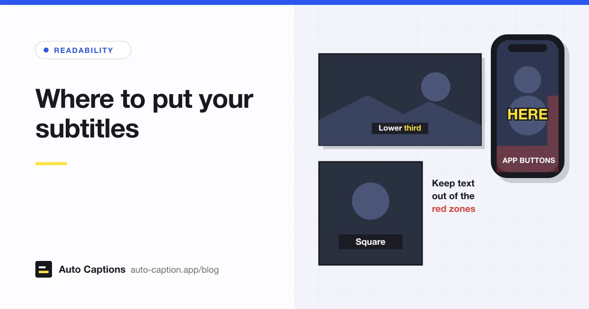
Where you put captions decides whether people can read them at all. A perfect transcript is useless under a TikTok like button, or on top of the name graphic that tells viewers who's speaking. Placement rules differ by frame shape, so this guide goes through widescreen, vertical and square video in turn, then covers color and contrast.
Why bottom center is the default
The BBC Subtitle Guidelines call the bottom of the screen "the normally accepted position" for subtitles. Netflix's style guide says all subtitles should be center justified and placed at the top or bottom of the screen. The reasons are practical. Faces and most of the action sit in the middle and upper part of a widescreen frame. And viewers learn where to look: when every line appears in the same spot, their eyes can drop down, read, and go back up to the picture.
"Bottom" doesn't mean touching the edge. For online 16:9 video, the BBC keeps subtitles inside the central 90% of the frame vertically and the central 75% horizontally. The margin keeps text clear of the edges, where player controls appear and some screens crop the picture.
When to move captions to the top
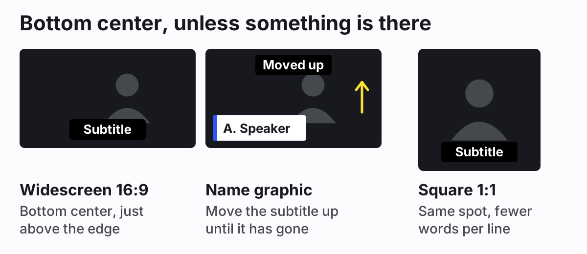
The BBC's rule is that subtitles shouldn't cover on-screen text, any part of a speaker's mouth, or other important action. Netflix says the same about on-screen text: position subtitles to avoid overlapping it, and if text sits at both the top and the bottom, put the subtitle wherever it's easier to read. In practice, move captions up when:
- A lower-third graphic shows a speaker's name and title.
- There's burned-in text at the bottom: a chart label, a product name, a translated sign.
- The action happens low in the frame. The BBC's example is snooker, where so much happens at the bottom of the screen that top positioning becomes the norm for the whole broadcast.
- A scoreboard, ticker or watermark is already there.
Move them back down once the graphic has gone. Captions that jump around for no reason are harder to follow than captions that stay put.
One limit of our editor to know about: caption position is set for the whole video, not per line. If a name graphic appears for five seconds, the simplest fix is to add that graphic in your video editor after you burn in the captions, and leave room for it. Or raise all captions a little so they clear it.
Caption placement on vertical video
Vertical video breaks the bottom-center rule, because the app draws its own interface over the bottom of your video. TikTok, Instagram Reels, Facebook Reels and YouTube Shorts all put their buttons (like, comment, share) along the right edge and the account name and post text along the bottom. A caption sitting where it would on YouTube ends up under all of that.
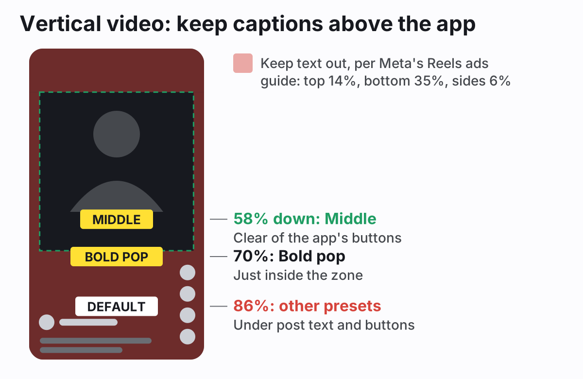
The clearest official numbers come from Meta. Its ads guide for Instagram Reels says to consider leaving at least 14% of the top, 35% of the bottom and 6% of each side free of text, logos and other important elements. That's written for ads, which carry an extra call-to-action button, so it's on the cautious side. I still use it for every vertical video, since you can't control whose phone, app version or text size your viewers have.
TikTok's ad specs say the safe zone depends on the video dimensions, the length of the post caption and any extra ad formats. YouTube's Shorts player has the same basic layout, with buttons on the right and the channel name and title at the bottom. Apps redesign these overlays from time to time, so treat any exact pixel number with suspicion and check a test upload.
The BBC comes at this from a different angle. It says subtitles on 9:16 video usually sit a little higher than on landscape, still in the lower third, because faces tend to be in the top half. That's advice for the BBC's own player. On TikTok, Reels and Shorts, the lower third is where the app's overlay is, so the middle of the frame is the better spot: below the face, above the interface.
What to change in our editor
The Karaoke, Classic and Boxed presets place captions low, with the bottom of the text 86% of the way down the frame. That's right for widescreen and wrong for Reels, since it's well inside the bottom 35%. For vertical video, open Layout and either press Middle (58% down) or drag the Fine-tune slider to about 60%. You can also drag the caption up on the video preview. The Bold pop preset already sits higher, at 70%, with large uppercase text. Its line sits just inside the top of Meta's bottom zone, so set Fine-tune to 65% or less if you want full clearance. There's no automatic safe-zone check, so upload a private test first if the placement really matters.
For platform-specific steps, see adding captions to Instagram Reels. If you film and post from your phone, our guide on captioning a video on iPhone covers the whole flow.
Square video
For 1:1 video the BBC keeps subtitles inside the central 90% of the frame, both vertically and horizontally, with up to two lines. Bottom center still works. The difference is width. A square frame at the same text size holds fewer words per line than a 16:9 one, so captions need to be shorter or they wrap onto a second line. In our editor, text size is set relative to the shorter side of the video, so a caption on 1080 × 1080 video has the same pixel size as on 1920 × 1080, just with less room beside it. Setting Caption length to Short (28 characters) cuts down on wrapping, and Punchy (18) keeps nearly every caption on one line.
If a square video will play in a feed with post text or buttons below or over it, the same logic as vertical video applies: raise the captions a little and test.
Subtitle color and contrast
White is the standard. The BBC says most subtitles are white text on a black background for legibility, and Netflix's English guide sets the font color to white. For telling speakers apart, the BBC adds yellow (#FFFF00), cyan (#00FFFF) and green (#00FF00), in that order, and says each must appear on a black background.
The color of the text matters less than what's behind it. A video changes from frame to frame, so white text that reads well over a dark room disappears when the camera pans to a window. For text on web pages, WCAG's contrast minimum is 4.5:1 (3:1 for large text). No video background holds a ratio like that on its own, which is why subtitles use an outline, a shadow or a box: they give the text its own dark edge, whatever the picture does.
- White text with a dark outline is the most versatile. It works on almost any footage and hides very little of the picture.
- A semi-transparent dark box is the safest over busy or very bright footage, at the cost of covering more of the frame.
- Yellow reads well as a highlight or a second speaker. Dark text on a yellow box, as in our Karaoke preset's active word, is very high contrast.
- Avoid colored text with no outline, light text on a light box, and anything that relies on color alone to mean something.
Font, outline width and box opacity are covered in more detail in our guide to choosing a readable subtitle font and outline.
Where to put captions: a quick reference
| Video | Position | Watch out for |
|---|---|---|
| YouTube, course, website (16:9) | Bottom center, inside the frame edge | Name graphics, player controls |
| Interview with name graphics | Top while the graphic shows, bottom otherwise | Covering faces at the top |
| TikTok, Reels, Shorts (9:16) | Around the middle, below the face | Bottom third and right-edge buttons |
| Square (1:1) | Bottom center, raised a little in feeds | Long lines wrapping |
Placement is one of three things that decide whether captions get read. The other two are line length and timing, both covered in our guide to subtitle length, reading speed and timing. When the position looks right in the preview, the burn-in tool renders the captions into the MP4 exactly where you put them.